

What I like about it is it gives you a quick history of stock and bond returns. I find looking back at history gives me more confidence in what to expect in the future, especially when markets drop. Also, having a better understanding of historical returns may help you with your investment allocation decisions, possibly leading to higher expected returns.
Okay, here it is, the link to the Index Matrix. When you open it up you will see a graph like the one below.
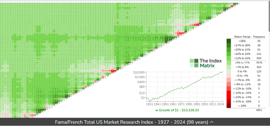
What stands out when you look at the graph? There is lots of green and bits of red. This is a graph of the S&P 500, the leading U.S. stock market index, showing the return for each year, before inflation, from 1927 to 2024. Green represents positive years and red, negative years. The deeper the shade, the higher or lower the return.
The numbers along the diagonal represent the entry year into the market. Some years are negative (red) and most are positive (green). If you look along the diagonal for a red square and then look straight up, north, until the squares turn green, that is how many years it took before receiving a positive annual return. Think of the diagonal as the barbed wire of investing. Once you get over it, your original investment is in the green pastures of positive returns.
A reminder of market realities
With the page open, move your curser to the red square at the year 2000. That year the return was -11.7%. Now slide your curser north to 2010. The average annual rate of return over that 10-year period was 1.1%. That represents 10 years of no growth in the S&P 500.
Using the dropdown menu, look at Canadian market returns. For the same period, 2000 to 2010, the average rate of return was 11.6%. U.S. small value stocks (small-cap stocks with a value tilt), below, returned 11.9% between 2000 to 2010. This is a good example of how diversification can reduce risk.
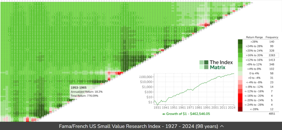
As a reader of MoneySense you may have read that, over time, small value stocks have provided higher returns than large company stocks. This is evident in the graph above with the darker shades of green that are on the S&P 500 chart. However, since 2003 the S&P 500 has outperformed the U.S. small value. Will small value get back to its historical long-term returns?